A complete, governed design system: from principles and tokens to components, patterns, accessibility and an AI-augmented operating model.
This reference documents the system end to end, the way a product organization would consume it. It is live: the four pages and 30+ case studies of this portfolio are rendered from these exact tokens, templates and rules, so every specification on this page can be verified in the product itself.
5
design principles
10
color tokens with roles
7
type roles
14
components
5
states per component
100%
text pairs WCAG 2.2 AA
Challenge
Present 25+ years of work across industrial design, innovation strategy and digital transformation to three audiences, without the experience fragmenting into three different looks or drifting with every new case study.
Approach
A token-first system with three tiers, a 14-component library with fully specified states, three page templates and one data model. Pages are generated, not hand-built, and every release is verified.
Outcome
4 pages and 30+ case studies on a single visual language. A token or template change reaches every page in one release, with syntax, contrast and visual checks before publish.
00 · Foundations
Principles
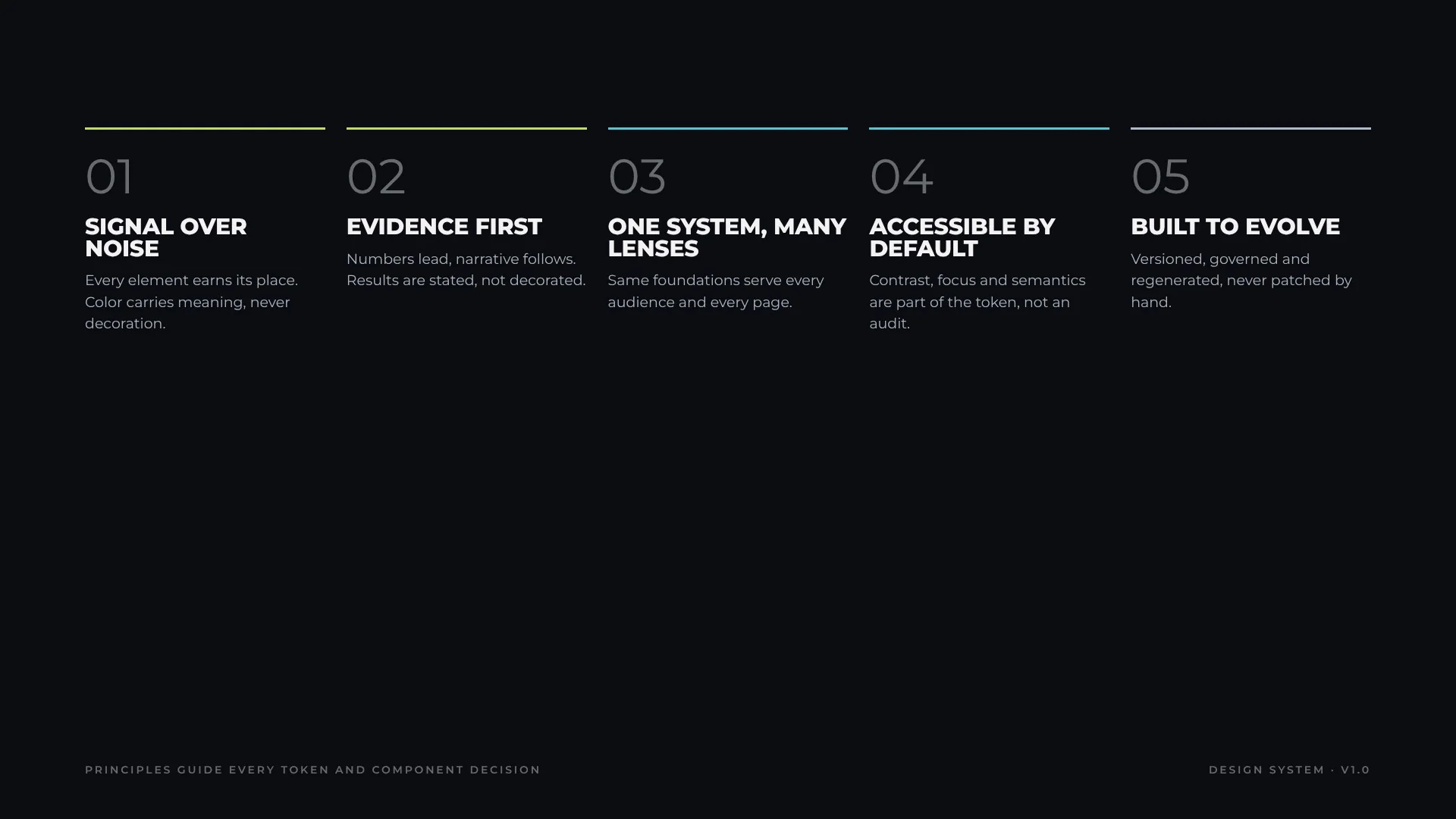
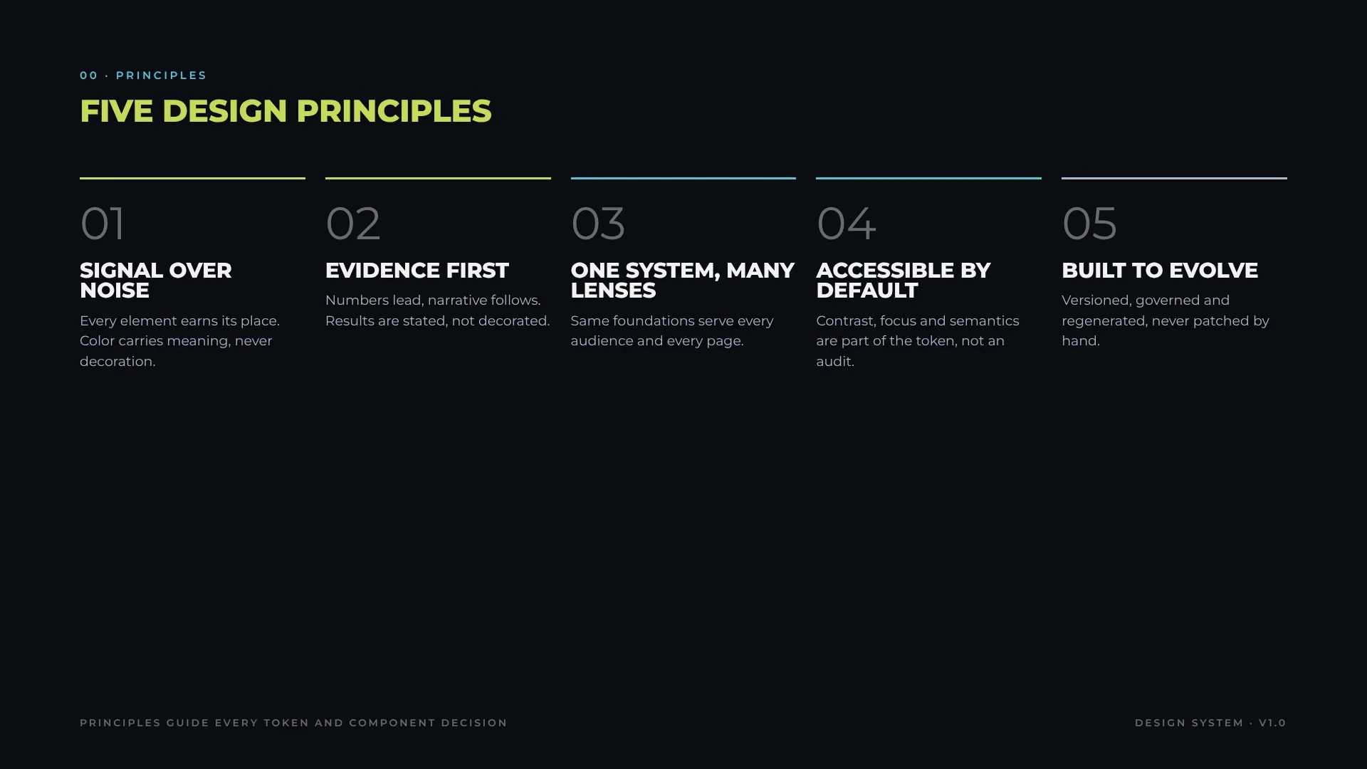
Five principles resolve design debates before they start. Every token and component decision is traced back to at least one of them.
Five design principles
01 · Foundations
Color
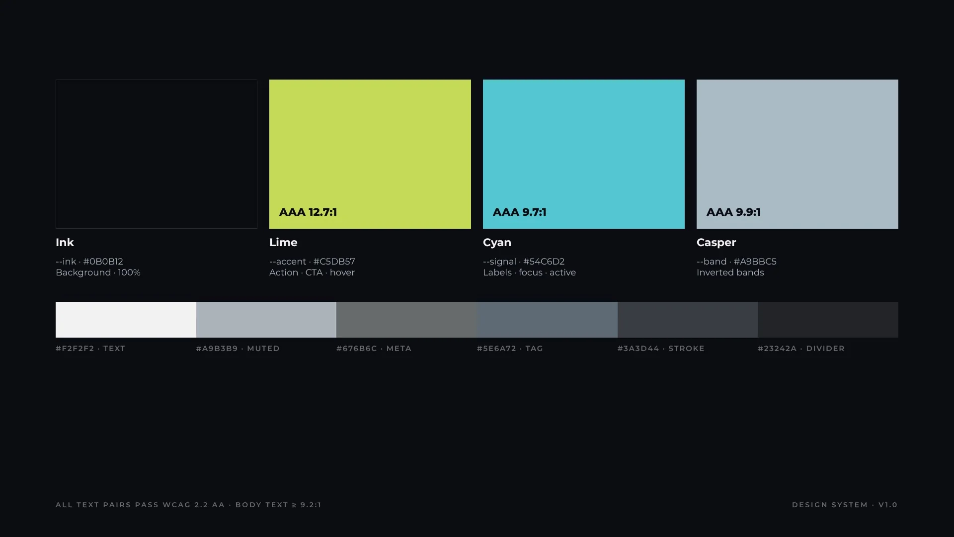
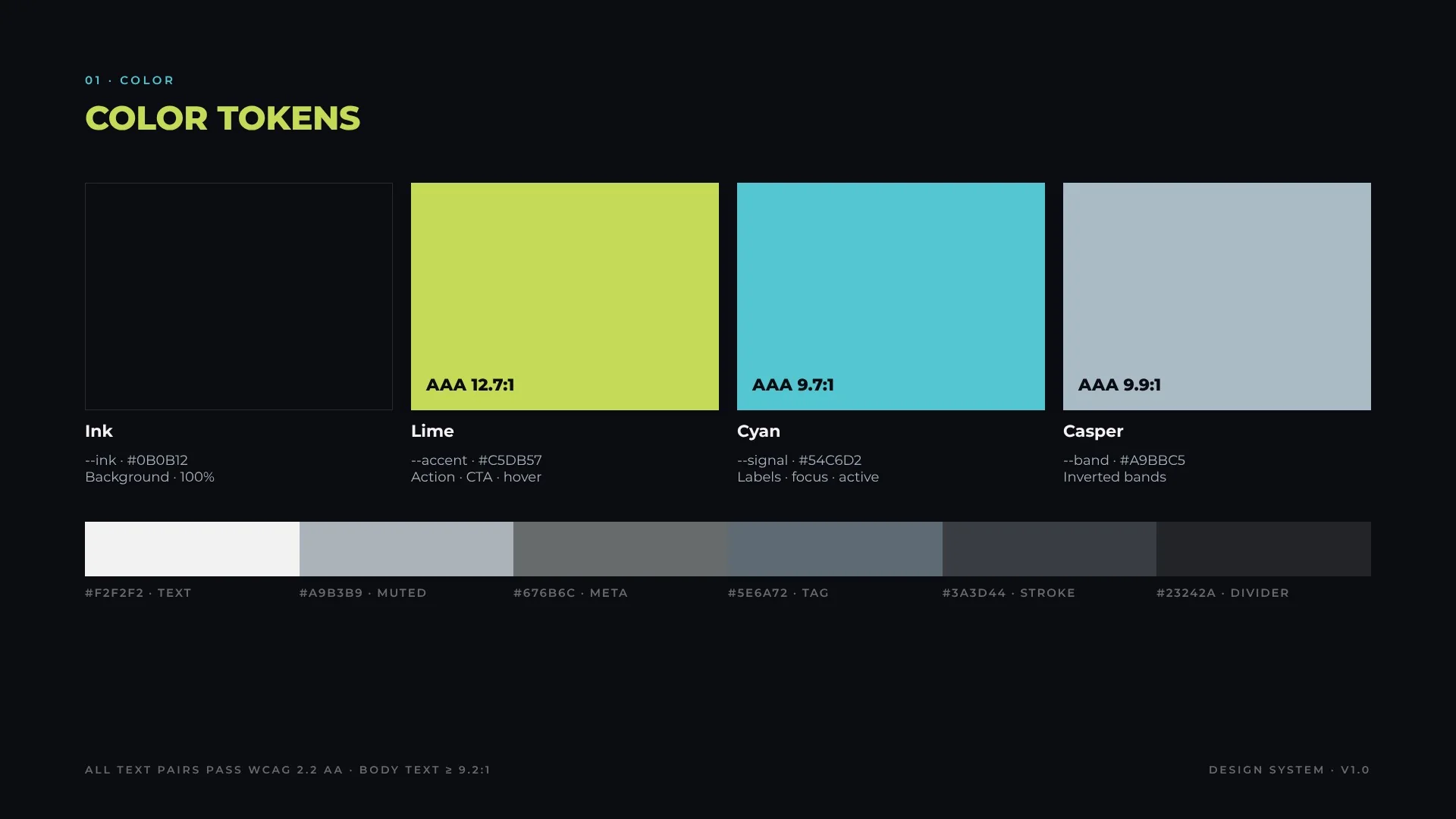
Color carries meaning, never decoration. Lime is reserved for action, cyan for orientation (labels, focus, active), casper for inverted bands that slow the reader down for detail. Neutrals do the rest.
--color-signal · #54C6D2 Labels, focus ring, active
AAA 9.9:1
Casper
--color-band · #A9BBC5 Inverted bands
TokenValueRoleContrast on ink
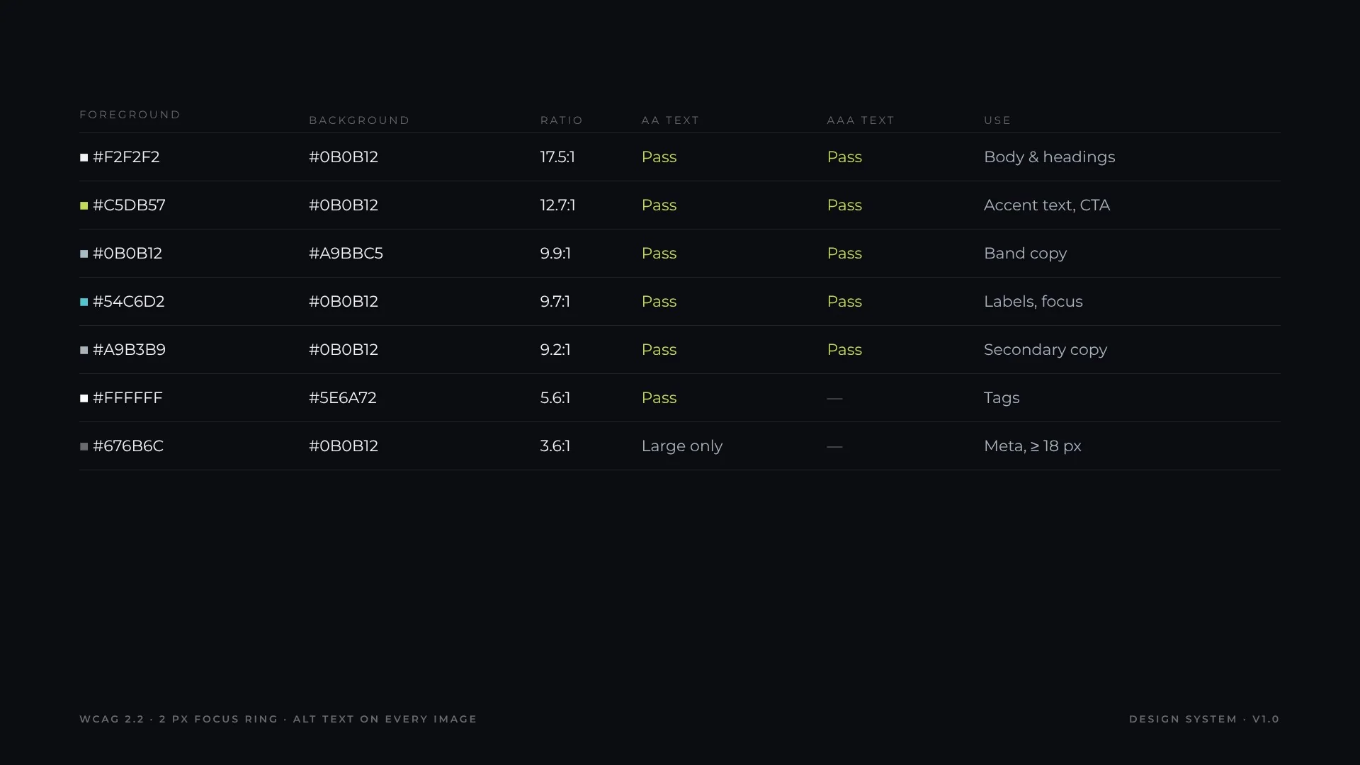
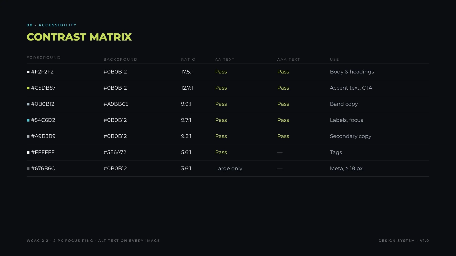
--text#F2F2F2Body and headings17.5:1
--text-muted#A9B3B9Secondary copy9.2:1
--text-meta#676B6CMeta, ≥ 18 px only3.6:1
--tag#5E6A72Tag fill (white text 5.6:1)—
--stroke#3A3D44Borders, outlines—
--divider#23242ATable rules—
Do
Use lime for one primary action per view
Use cyan for anything that orients: labels, focus, active
Pair casper bands with ink text only
Don’t
Use accent colors for decoration or large fills
Put meta grey on body-size text
Introduce a new color without a semantic role
Color tokens
02 · Foundations
Typography
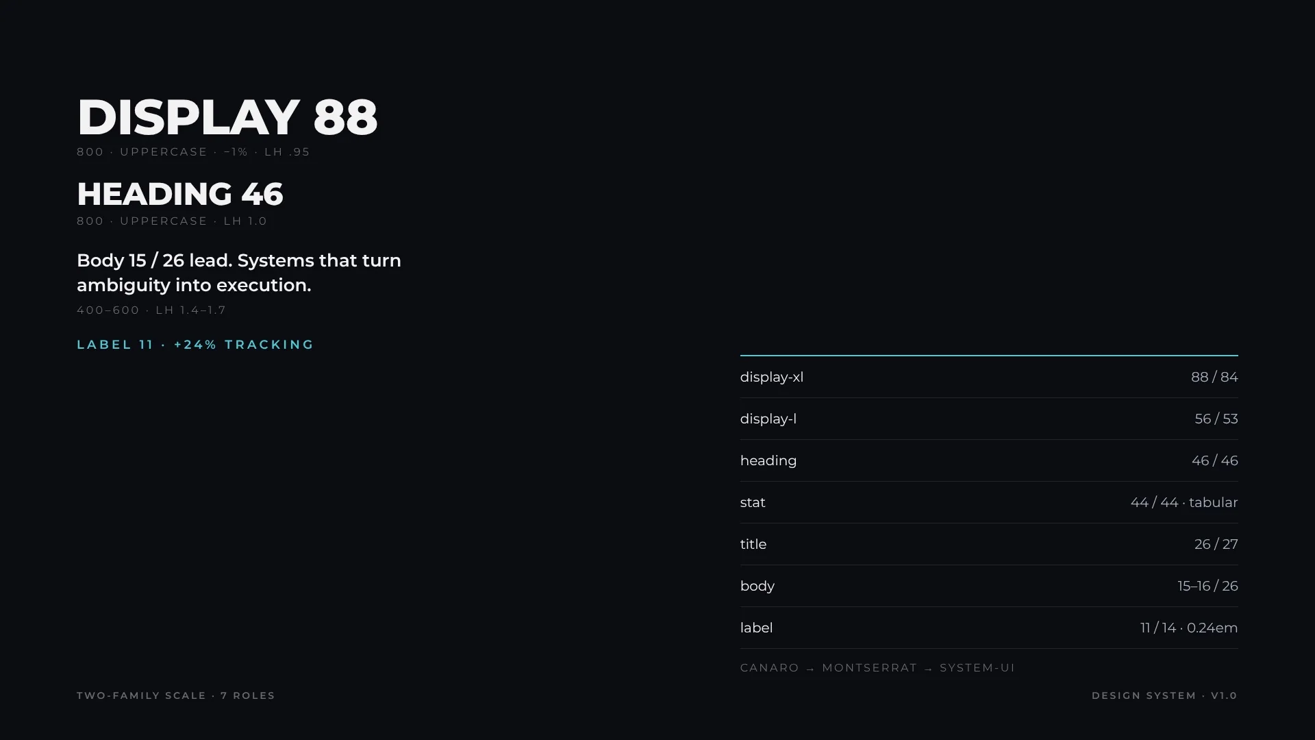
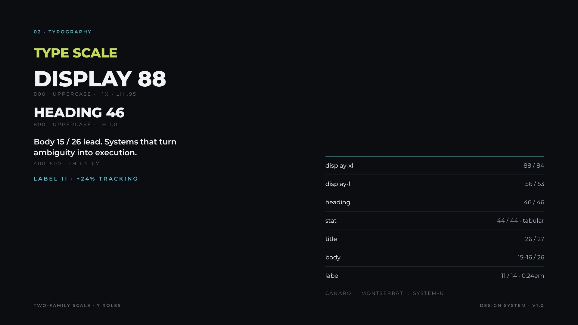
A two-family stack: Canaro for display, Montserrat as the web fallback, system-ui as the last resort. Display is always uppercase with tight leading; labels use wide tracking so they read as navigation, not prose.
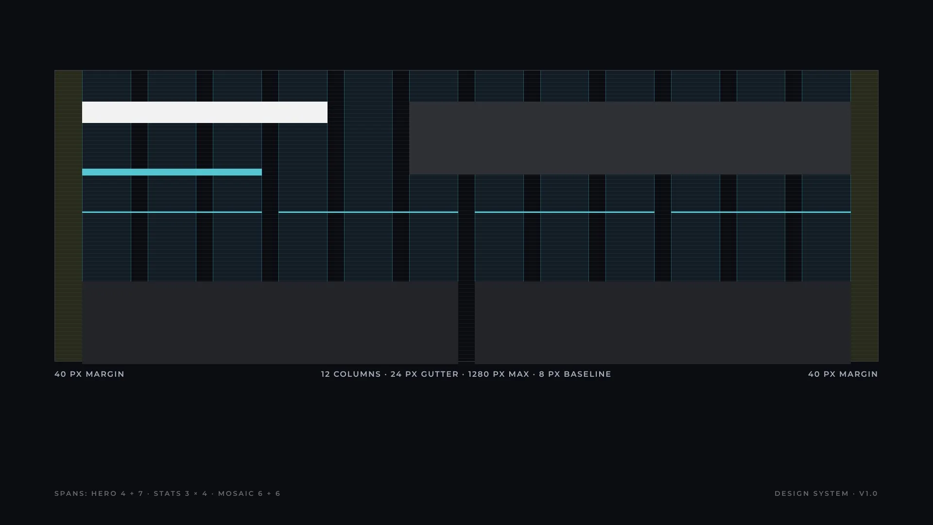
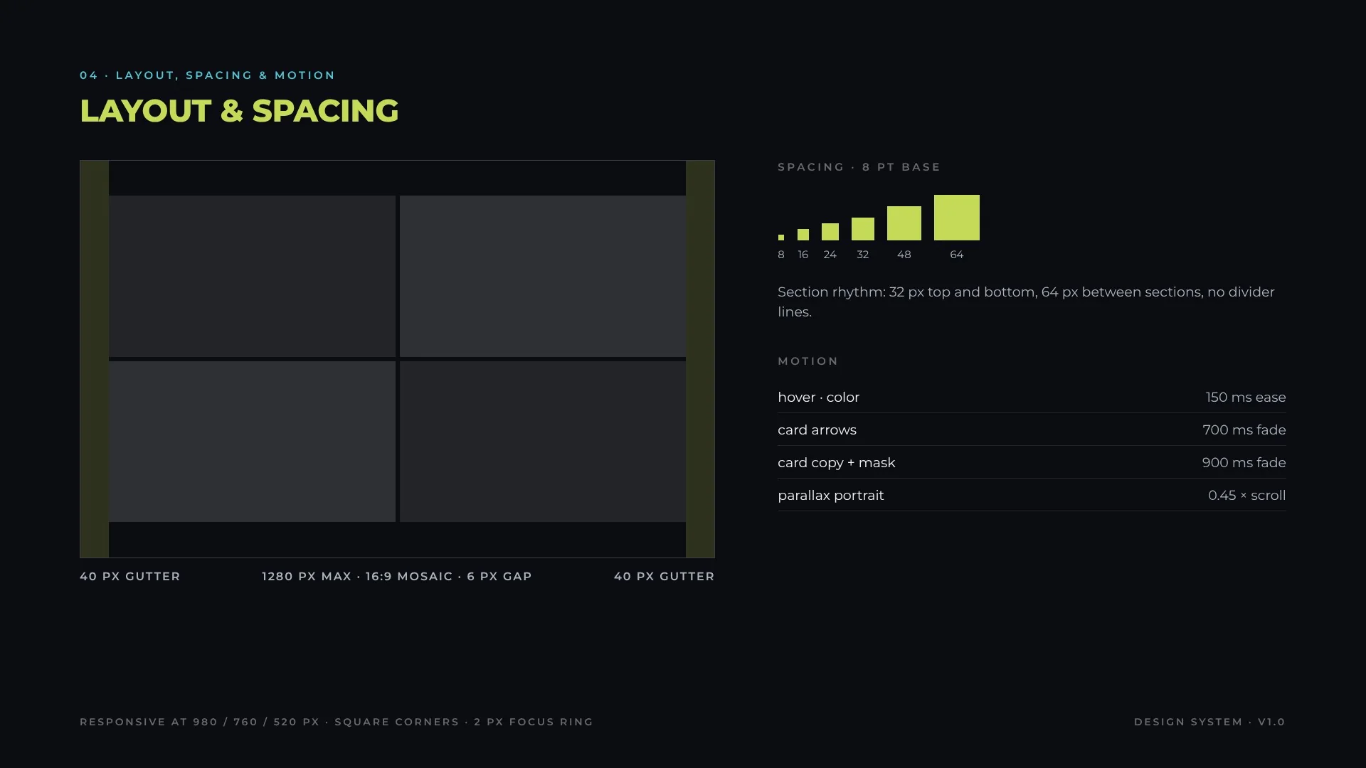
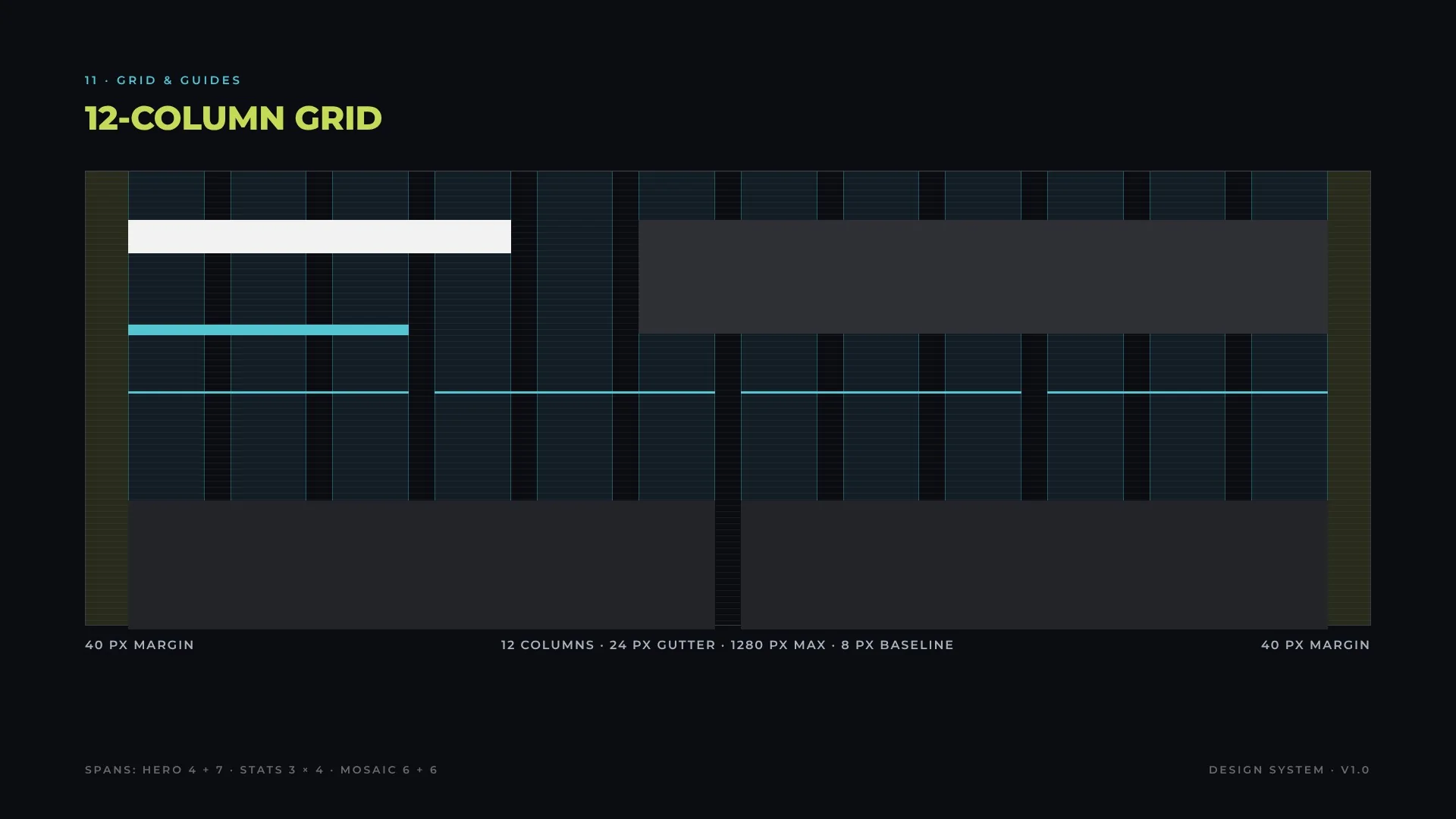
A 12-column grid on a 1280 px canvas with 40 px outer margins and 24 px gutters, over an 8 px baseline. Layouts snap to column spans, never to arbitrary widths.
12-column grid
ElementSpanNotes
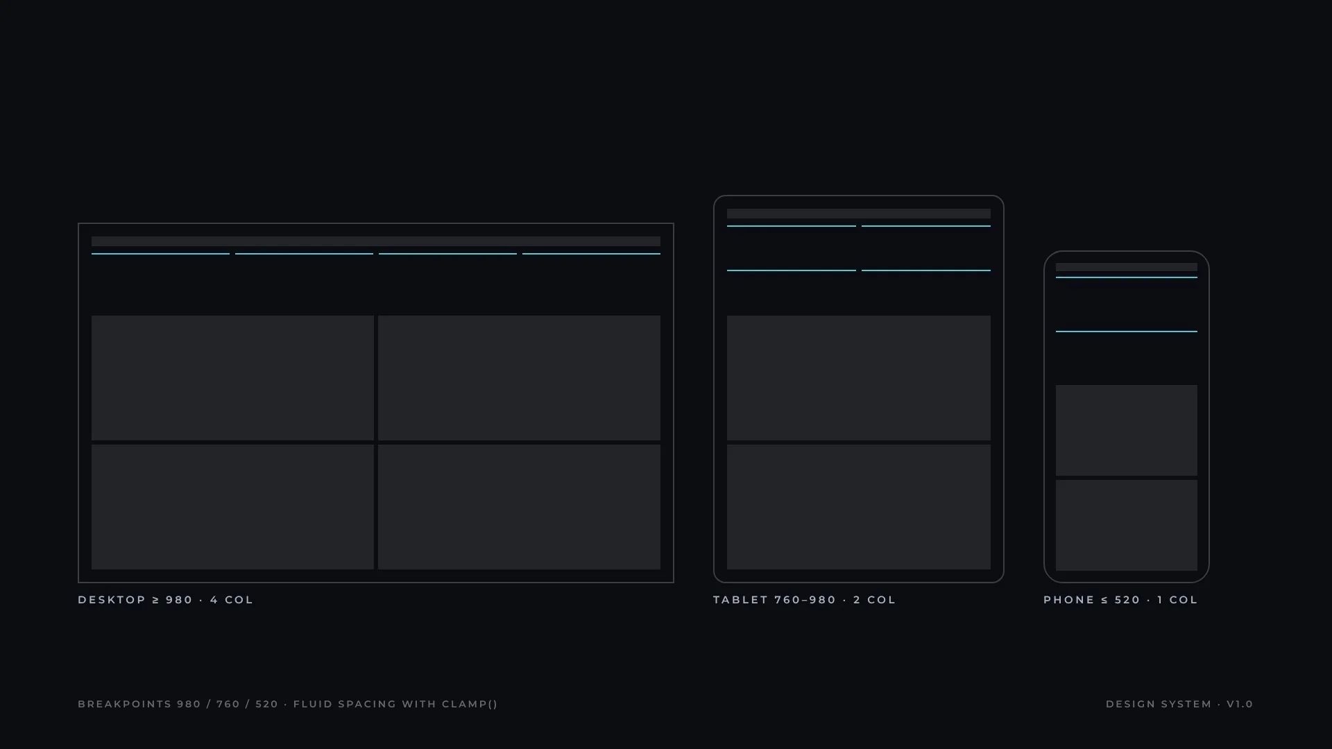
Hero4 + 7 (with 1 col air)Copy left, portrait right; stacks under 760 px
Stat row3 × 4Becomes 2 × 2 under 980 px
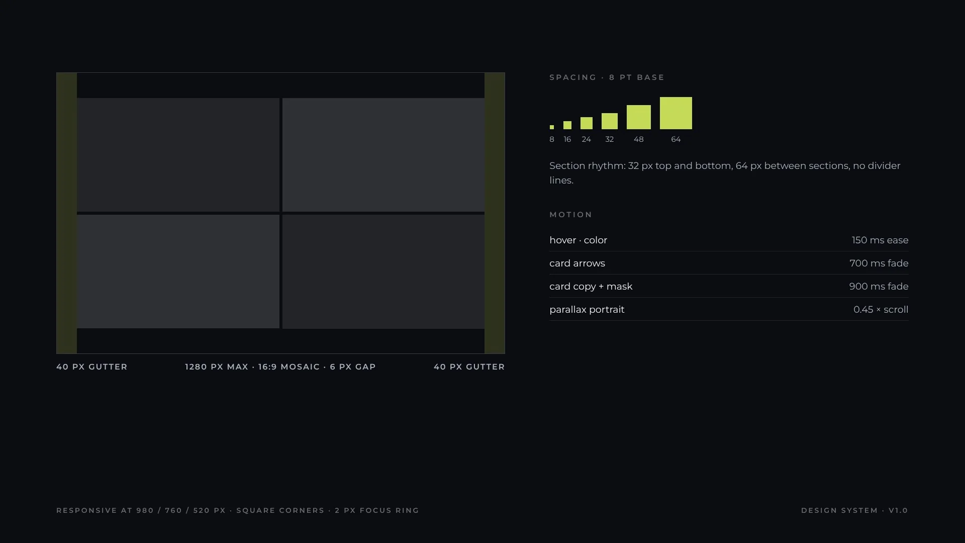
Project mosaic6 + 616:9 tiles, 6 px gap overrides the gutter
Case intro5 + 7Title block and narrative
Text measuremax 8 columnsAbout 65–80 characters per line
Baseline8 pxAll vertical spacing is a multiple of 8
04 · Foundations
Shape & elevation
The system is flat and architectural. Corners are square everywhere; hierarchy comes from contrast, rules and space rather than shadows.
TokenValueUse
radius0All surfaces, buttons and inputs
stroke-11 pxOutlines, inputs, dividers
stroke-22 pxStat rules, focus ring, nav underline
stroke-33 pxProcess stage rules
shadownoneOnly carousel arrows use a 1 × 3 px drop shadow for legibility on images
05 · Foundations
Iconography & imagery
Icons are typographic: arrows (→ ↓), plus and minus, set in the label style so they inherit color and state. Imagery is product-led and always 16:9.
RuleSpecification
Image ratio16:9, cropped or padded on the product background, never stretched
Delivery1920 × 1080, RGB, JPEG quality 86–90
Alt textDescribes the product and context, not the file
LogosMonochrome on ink, height-matched by optical size
IconsUnicode glyphs in the label style; no icon font dependency
06 · Foundations
Motion
Motion confirms an action or reveals content; it never carries meaning on its own.
TokenValueUse
motion-fast150 ms easeColor changes on hover and active
motion-reveal700 msCard arrows fade in
motion-mask900 msCard copy and gradient mask
motion-parallax0.45 × scrollHero portrait
motion-counton view, 20% thresholdStat count-up
marquee70 s loopAward and partner strips
Do
Respect prefers-reduced-motion: stop marquee and parallax
Animate opacity and color, not layout
Don’t
Hide information behind animation
Stack more than one motion per element
07 · Architecture
Tokens
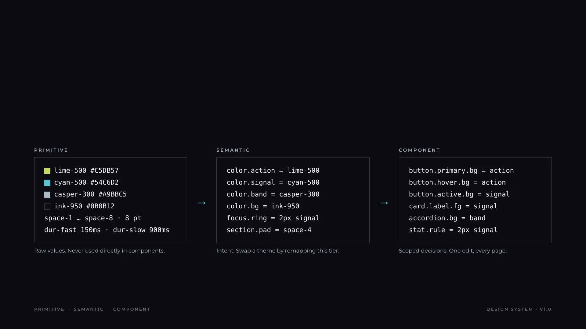
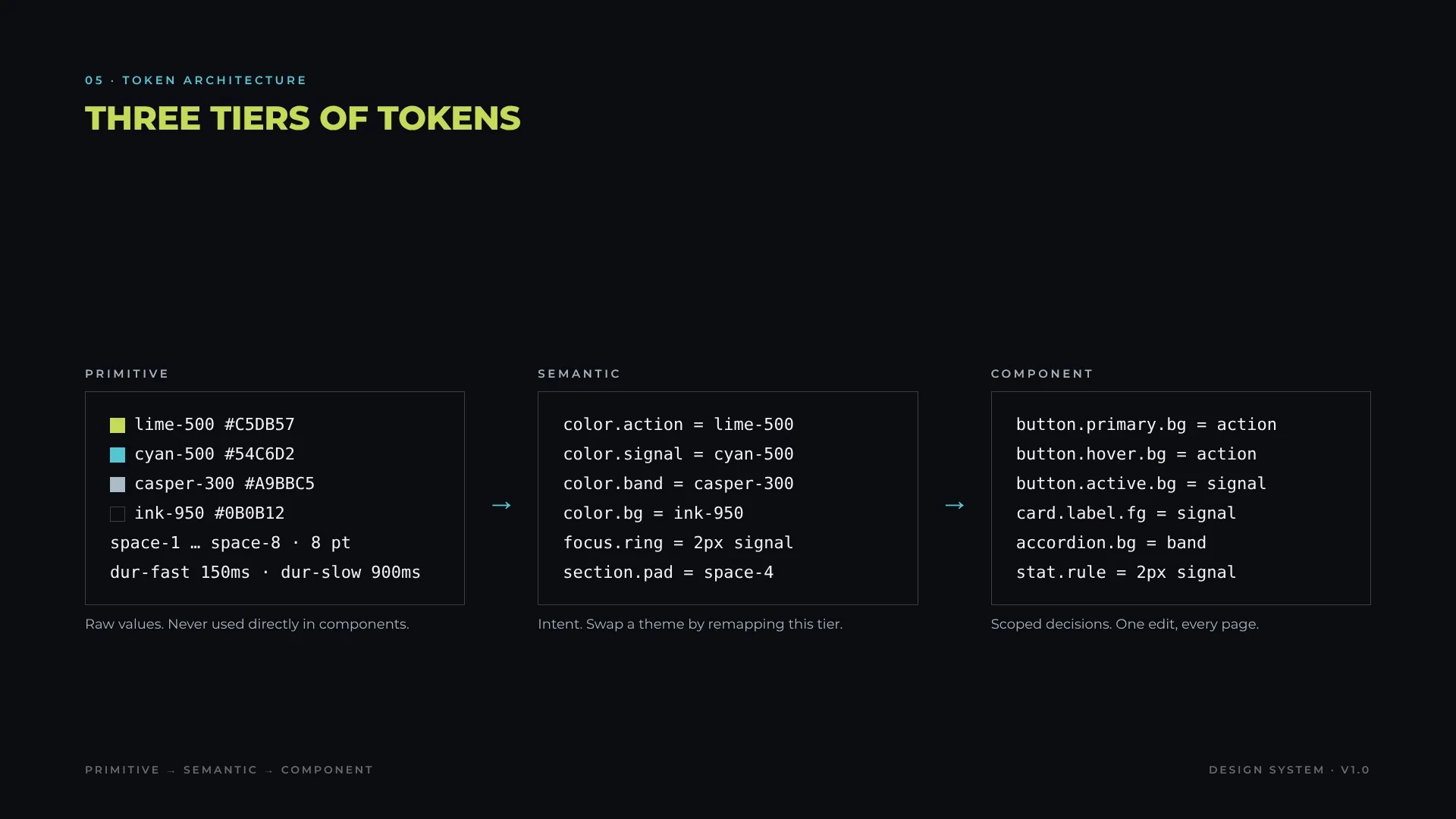
Three tiers separate raw values, intent and component decisions. A theme (for example a light or client-branded version) is a remap of the semantic tier only.
Project card16:9 media · mask · category · title · result · View caseCopy fades in on hover, arrows browse imagesAlt text per slide, link on title
Carousel arrowsChevrons with drop shadowClick hides copy for a clean imageButtons with labels
Dot pager22 × 3 px barsCurrent bar in accentDecorative, mirrored by arrows
Stat tile2 px cyan rule · number · captionCounts up on viewFinal value rendered for readers
AccordionCasper band · header · Learn moreOne open at a time, keeps scroll anchoraria-expanded
Detail tagFill #5E6A72 · white labelStatic5.6:1 contrast
MarqueeLogo or award strip70 s loopPaused for reduced motion
Process stageNumber · key · title · copyGrouped under 3 stage arrowsOrdered list semantics
Input1 px stroke · placeholderCyan on focusLabel associated
CTA bandAccent band · title · 2 buttonsStaticDark text on lime 12.7:1
Component library
08b · Library
Buttons & actions
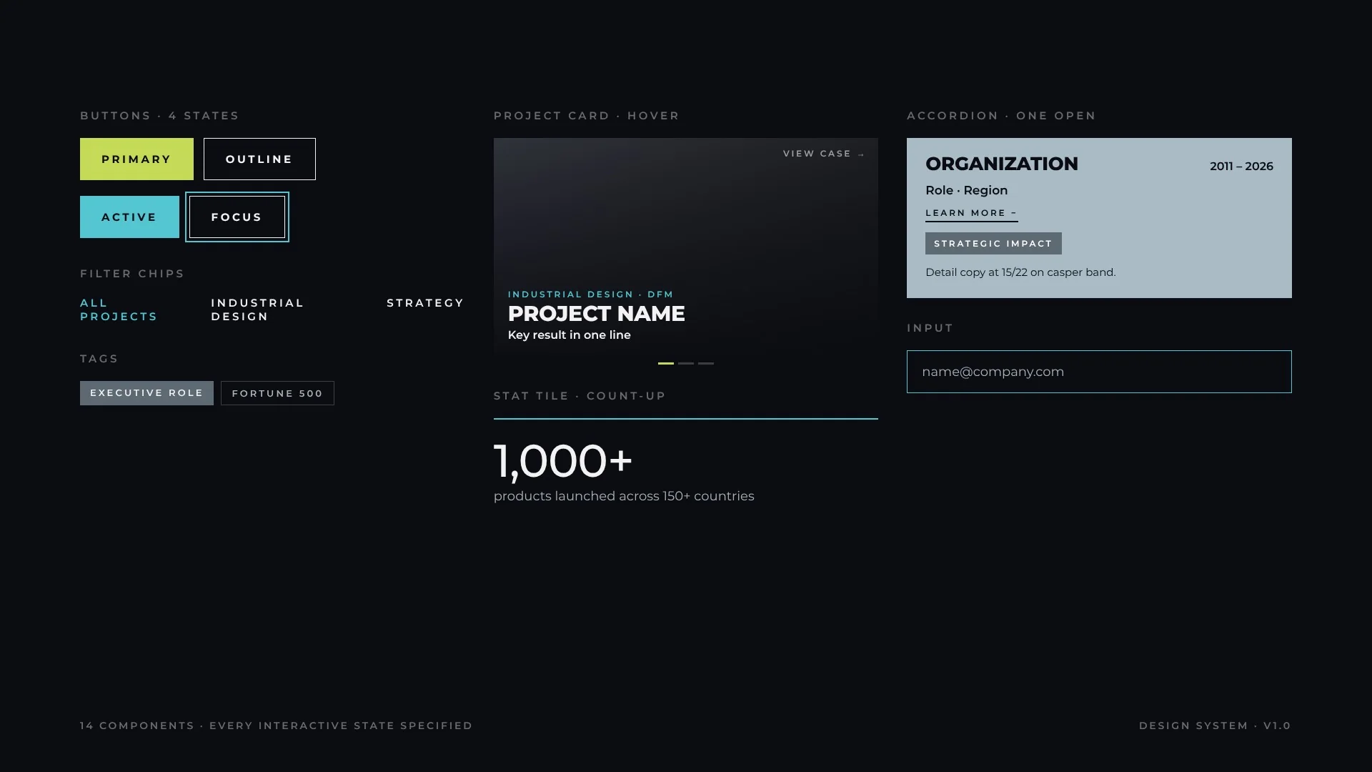
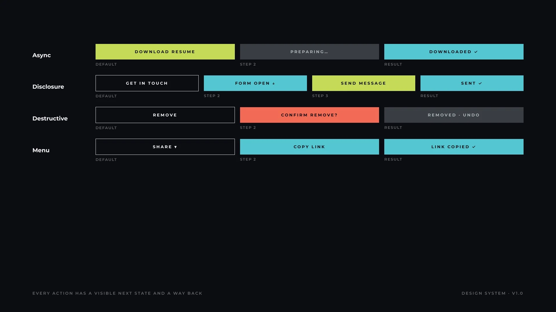
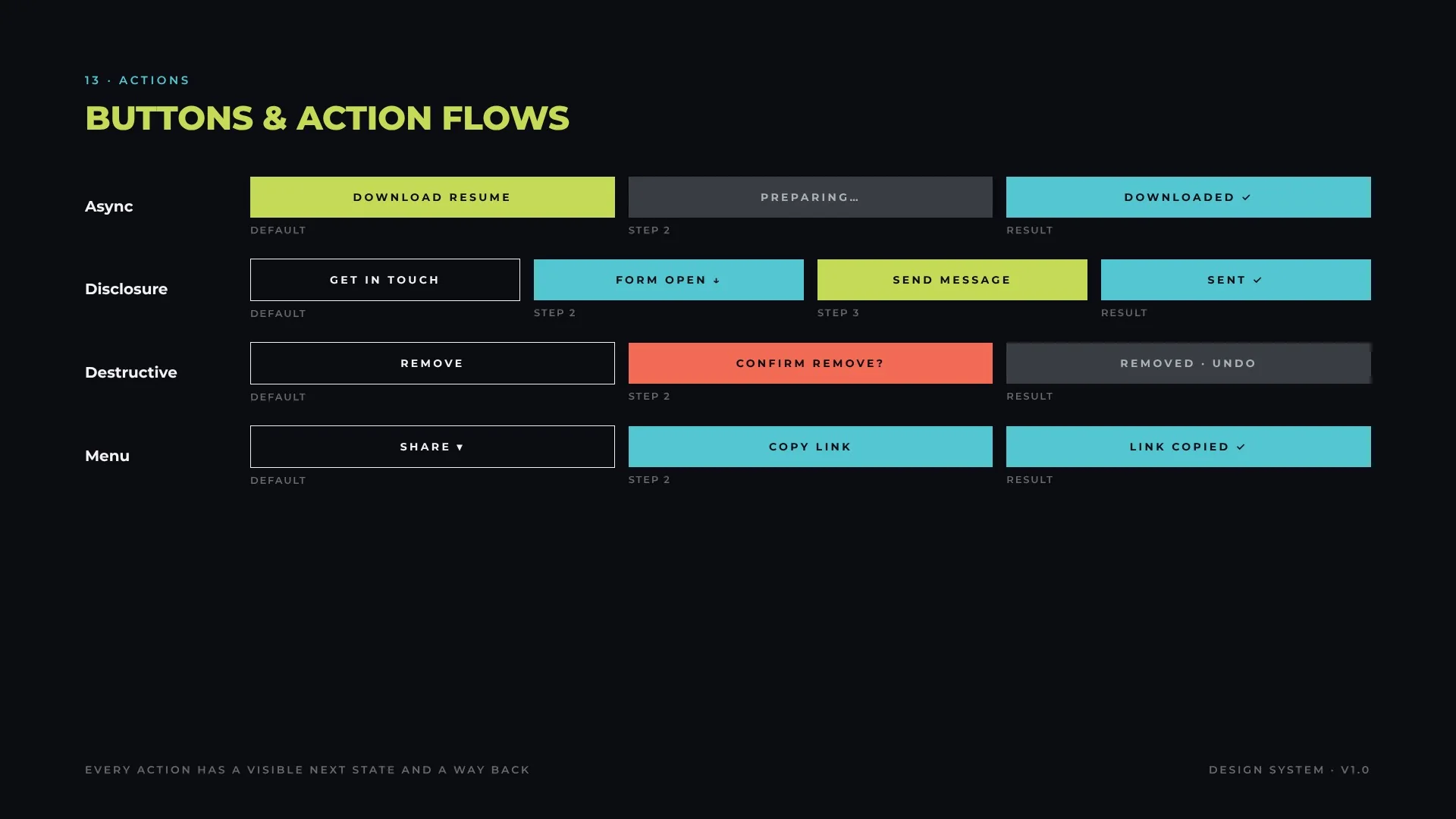
Buttons are specified as flows, not static shapes: every action shows its next state and offers a way back. The examples below are live; try them.
AsyncLoading and confirmation
DisclosureReveal, submit, confirm
DestructiveConfirm, then undo
MenuChoose, then feedback
ToggleSegmented, single select
PatternSequenceRule
AsyncDefault → Loading (disabled) → Success → resetNever leave a button in loading without a timeout
DisclosureDefault → Expanded → Submit → Confirmationaria-expanded mirrors the panel
DestructiveDefault → Confirm (orange-red) → Done + UndoDestructive color appears only at the confirm step
MenuClosed → Open → Item → FeedbackEsc and outside click close the menu
ToggleOne of N selectedaria-pressed on each option
Buttons & action flows
09 · Interaction
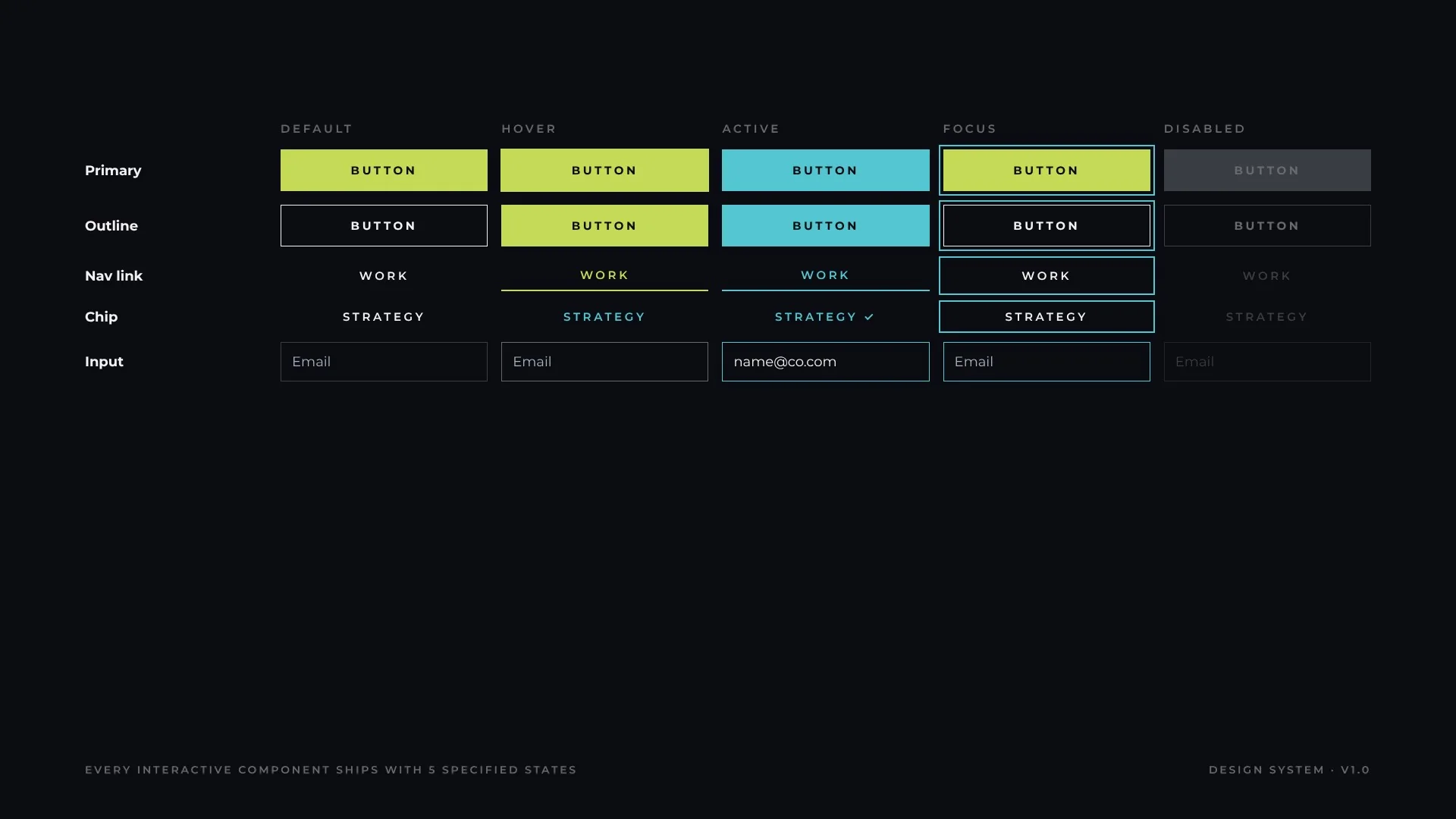
States
Every interactive component ships with five specified states. Focus is always visible and always the same: a 2 px cyan ring offset 3–4 px.
State matrix
10 · Patterns
Templates & responsive
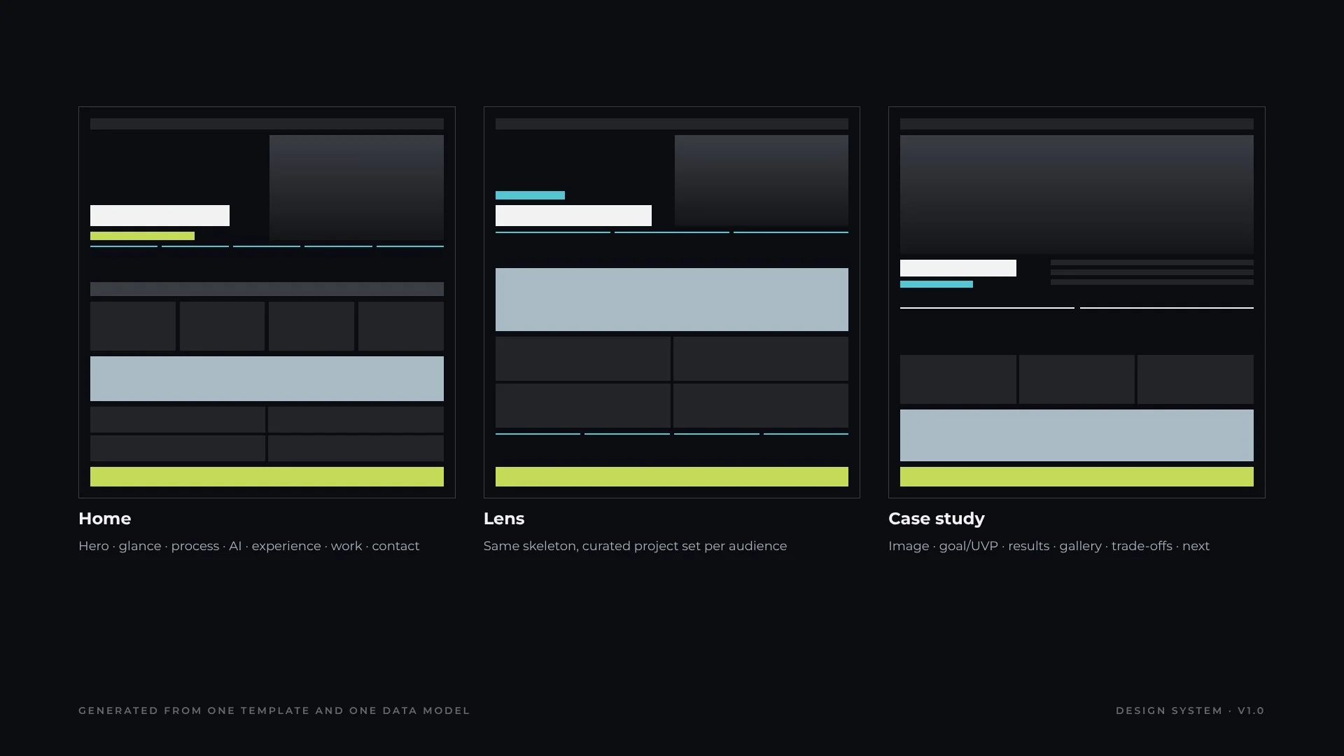
Three templates cover the whole product. Home tells the full story; lens pages reuse the same skeleton with a curated project set per audience; case studies follow a fixed narrative (goal, value proposition, results, innovation, gallery, trade-offs, role) so projects can be compared like for like.
Three templates, 35+ pages
One system, every screen
11 · Content
Content & voice
The voice is executive, direct and evidence-led. Copy states what happened and what it changed, and lets numbers do the persuading.
ElementRule
ResultsNumber first, then the claim: “47% reduction in muscular effort”
AttributionCompany metrics are labelled as environment, not personal results
DatesEn dash, no spaces in ranges: 2011 – 2026 in headers, 2011–2026 inline
LabelsUppercase, 2–4 words, no punctuation
Brand namesKeep official casing: SensAI, GenAI, IoT, AugmentAge, DocSolution
PlaceholdersMarked [to confirm] until verified, never published as fact
12 · Patterns
Data display
Numbers are the hero of the system. They use tabular figures, a 2 px cyan rule and a one-line caption that names the source project.
1,000+
products launched
80+
international design awards
25+
patents
150+
countries reached
Do
One number, one caption, one source
Round honestly and add “+” only for floors
Don’t
Mix units inside one row
Animate numbers that readers must compare precisely
13 · Quality
Accessibility
Accessibility is built into the tokens, not audited at the end.
Contrast matrix
CheckpointStandard
Text contrastAll body pairs AAA; meta grey limited to large text
Focus2 px cyan ring, 3–4 px offset, on every interactive element
SemanticsLandmarks, labelled sections, ordered lists for processes
MediaDescriptive alt text on every image and slide
MotionDecorative only; reduced-motion stops marquee and parallax
TargetsButtons ≥ 44 px tall
14 · Operations
Governance
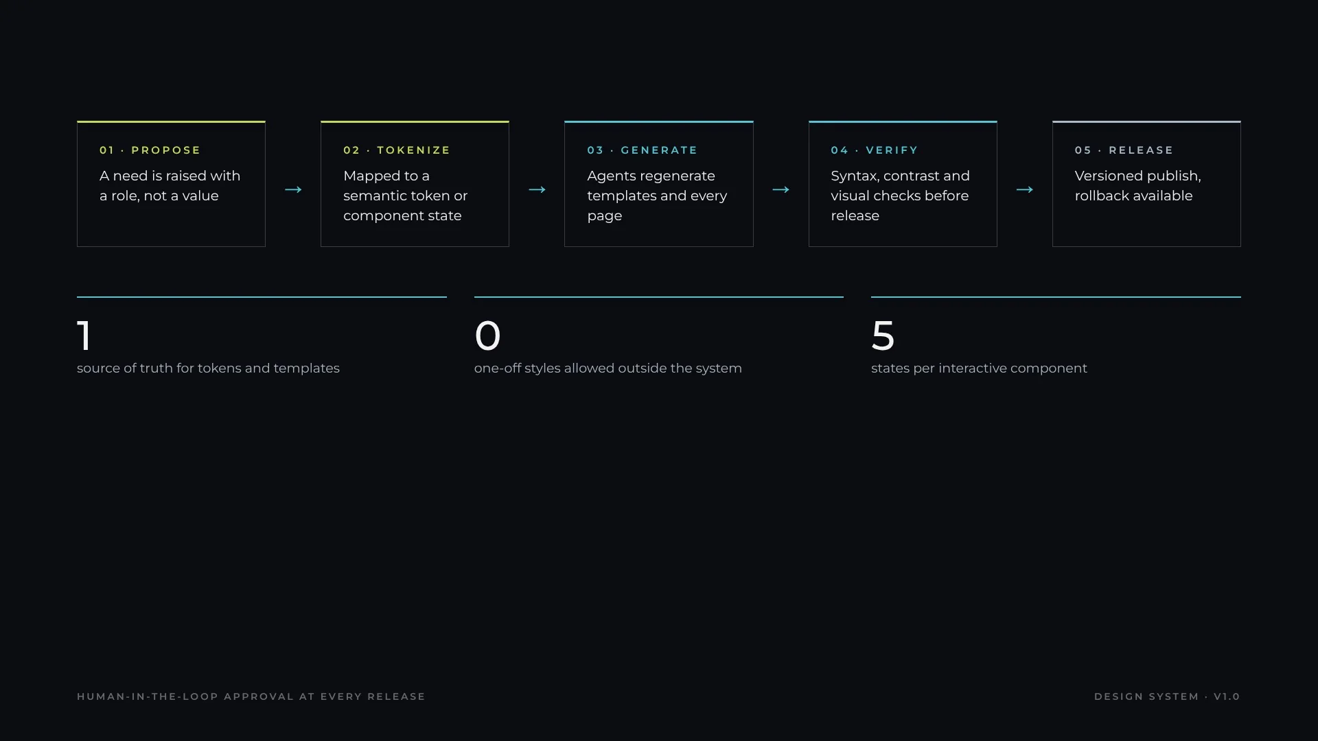
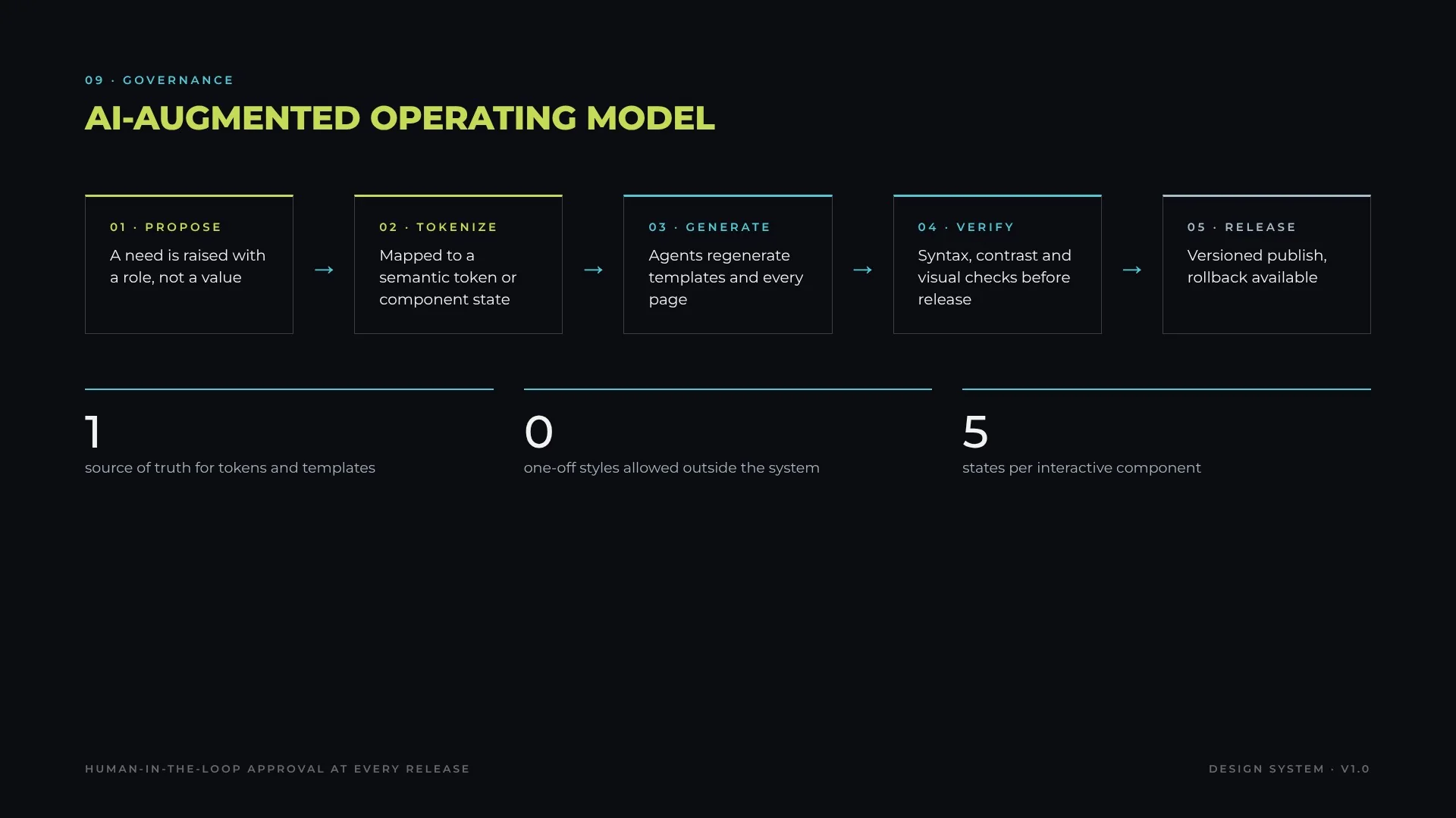
The system is run as a product, not a file. Changes follow a five-step flow with human approval at every release.
AI-augmented operating model
Contribution model
Anyone can propose; a proposal must name the role it serves and the principle it supports. New values enter only through the semantic tier.
Versioning
Semantic versioning: patch for fixes, minor for new components or tokens, major for renamed or removed tokens. Every release is reversible.
Quality gates
Syntax check of every generated page, contrast check of every new pair, and visual review of the affected templates before publish.
15 · Intelligence
AI & integrations
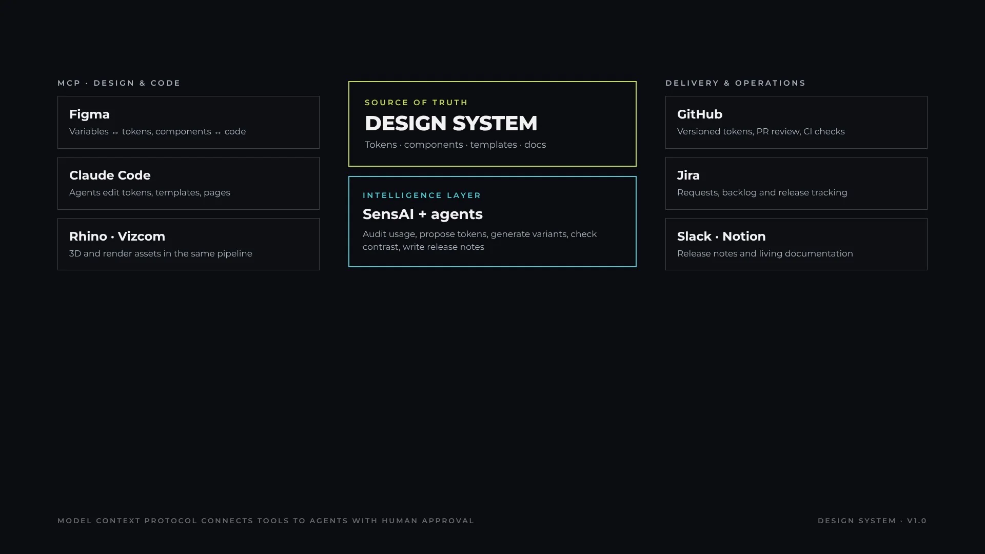
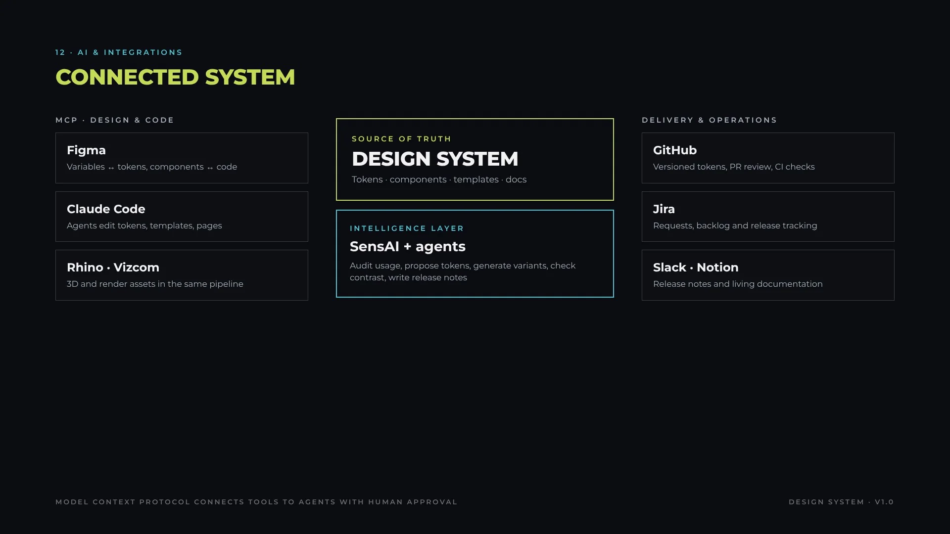
The system is connected, not stored. Tools talk to the design system through the Model Context Protocol (MCP) and APIs, agents act on it, and SensAI adds the intelligence layer, always with human approval before release.
Connected system
MCP connections
ConnectionWhat it does
Figma (MCP)Reads and writes variables and components so design tokens and code tokens stay in sync
Claude Code (MCP)Agents edit tokens, templates and pages from natural-language change requests
Rhino · Vizcom (MCP / API)3D models and AI renders feed the same asset pipeline and image specs
Browser automationHeadless renders for visual regression before every release
Agents
AgentResponsibility
Token agentProposes and applies token changes across every page
Audit agentScans pages for off-system values, contrast failures and missing alt text
Content agentChecks copy against the content rules (numbers, casing, attribution)
Release agentBuilds, verifies and drafts release notes for human approval
SensAI
SensAI, the AI-native innovation engine, sits above the system as its intelligence layer: it analyzes usage and audience signals, proposes component variants, and validates options with synthetic users before anything reaches the library.
Delivery & operations
ConnectionWhat it does
GitHubVersioned tokens and templates, pull-request review, CI checks on every change
JiraIntake of requests, backlog prioritization and release tracking
SlackRelease announcements and review requests to the team
Notion / ConfluenceLiving documentation generated from the same source
Google DriveShared source files, briefs and asset hand-off
16 · Operations
Tooling
The system is maintained with an AI-augmented toolchain, so one change propagates to every page at once.
LayerTooling
TokensCSS custom properties and component-level style tokens
GenerationTemplate generators build every case page from one data model
AgentsAI agents apply token and template changes across all pages
VerificationAutomated syntax checks and headless-browser renders for visual review
AssetsImage pipeline to 16:9, 1920 × 1080, RGB, with descriptive alt text
VersionChange
1.0Foundations, 14 components, 3 templates, governance model
0.9Accessibility pass: contrast matrix, focus ring, alt text
0.8Token tiers introduced; components moved to semantic tokens
A complete, governed design system: from principles and tokens to components, patterns, accessibility and an AI-augmented operating model.
This reference documents the system end to end, the way a product organization would consume it. It is live: the four pages and 30+ case studies of this portfolio are rendered from these exact tokens, templates and rules, so every specification on this page can be verified in the product itself.
5
design principles
10
color tokens with roles
7
type roles
14
components
5
states per component
100%
text pairs WCAG 2.2 AA
Challenge
Present 25+ years of work across industrial design, innovation strategy and digital transformation to three audiences, without the experience fragmenting into three different looks or drifting with every new case study.
Approach
A token-first system with three tiers, a 14-component library with fully specified states, three page templates and one data model. Pages are generated, not hand-built, and every release is verified.
Outcome
4 pages and 30+ case studies on a single visual language. A token or template change reaches every page in one release, with syntax, contrast and visual checks before publish.
00 · Foundations
Principles
Five principles resolve design debates before they start. Every token and component decision is traced back to at least one of them.
Five design principles
01 · Foundations
Color
Color carries meaning, never decoration. Lime is reserved for action, cyan for orientation (labels, focus, active), casper for inverted bands that slow the reader down for detail. Neutrals do the rest.
--color-signal · #54C6D2 Labels, focus ring, active
AAA 9.9:1
Casper
--color-band · #A9BBC5 Inverted bands
TokenValueRoleContrast on ink
--text#F2F2F2Body and headings17.5:1
--text-muted#A9B3B9Secondary copy9.2:1
--text-meta#676B6CMeta, ≥ 18 px only3.6:1
--tag#5E6A72Tag fill (white text 5.6:1)—
--stroke#3A3D44Borders, outlines—
--divider#23242ATable rules—
Do
Use lime for one primary action per view
Use cyan for anything that orients: labels, focus, active
Pair casper bands with ink text only
Don’t
Use accent colors for decoration or large fills
Put meta grey on body-size text
Introduce a new color without a semantic role
Color tokens
02 · Foundations
Typography
A two-family stack: Canaro for display, Montserrat as the web fallback, system-ui as the last resort. Display is always uppercase with tight leading; labels use wide tracking so they read as navigation, not prose.
A 12-column grid on a 1280 px canvas with 40 px outer margins and 24 px gutters, over an 8 px baseline. Layouts snap to column spans, never to arbitrary widths.
12-column grid
ElementSpanNotes
Hero4 + 7 (with 1 col air)Copy left, portrait right; stacks under 760 px
Stat row3 × 4Becomes 2 × 2 under 980 px
Project mosaic6 + 616:9 tiles, 6 px gap overrides the gutter
Case intro5 + 7Title block and narrative
Text measuremax 8 columnsAbout 65–80 characters per line
Baseline8 pxAll vertical spacing is a multiple of 8
04 · Foundations
Shape & elevation
The system is flat and architectural. Corners are square everywhere; hierarchy comes from contrast, rules and space rather than shadows.
TokenValueUse
radius0All surfaces, buttons and inputs
stroke-11 pxOutlines, inputs, dividers
stroke-22 pxStat rules, focus ring, nav underline
stroke-33 pxProcess stage rules
shadownoneOnly carousel arrows use a 1 × 3 px drop shadow for legibility on images
05 · Foundations
Iconography & imagery
Icons are typographic: arrows (→ ↓), plus and minus, set in the label style so they inherit color and state. Imagery is product-led and always 16:9.
RuleSpecification
Image ratio16:9, cropped or padded on the product background, never stretched
Delivery1920 × 1080, RGB, JPEG quality 86–90
Alt textDescribes the product and context, not the file
LogosMonochrome on ink, height-matched by optical size
IconsUnicode glyphs in the label style; no icon font dependency
06 · Foundations
Motion
Motion confirms an action or reveals content; it never carries meaning on its own.
TokenValueUse
motion-fast150 ms easeColor changes on hover and active
motion-reveal700 msCard arrows fade in
motion-mask900 msCard copy and gradient mask
motion-parallax0.45 × scrollHero portrait
motion-counton view, 20% thresholdStat count-up
marquee70 s loopAward and partner strips
Do
Respect prefers-reduced-motion: stop marquee and parallax
Animate opacity and color, not layout
Don’t
Hide information behind animation
Stack more than one motion per element
07 · Architecture
Tokens
Three tiers separate raw values, intent and component decisions. A theme (for example a light or client-branded version) is a remap of the semantic tier only.
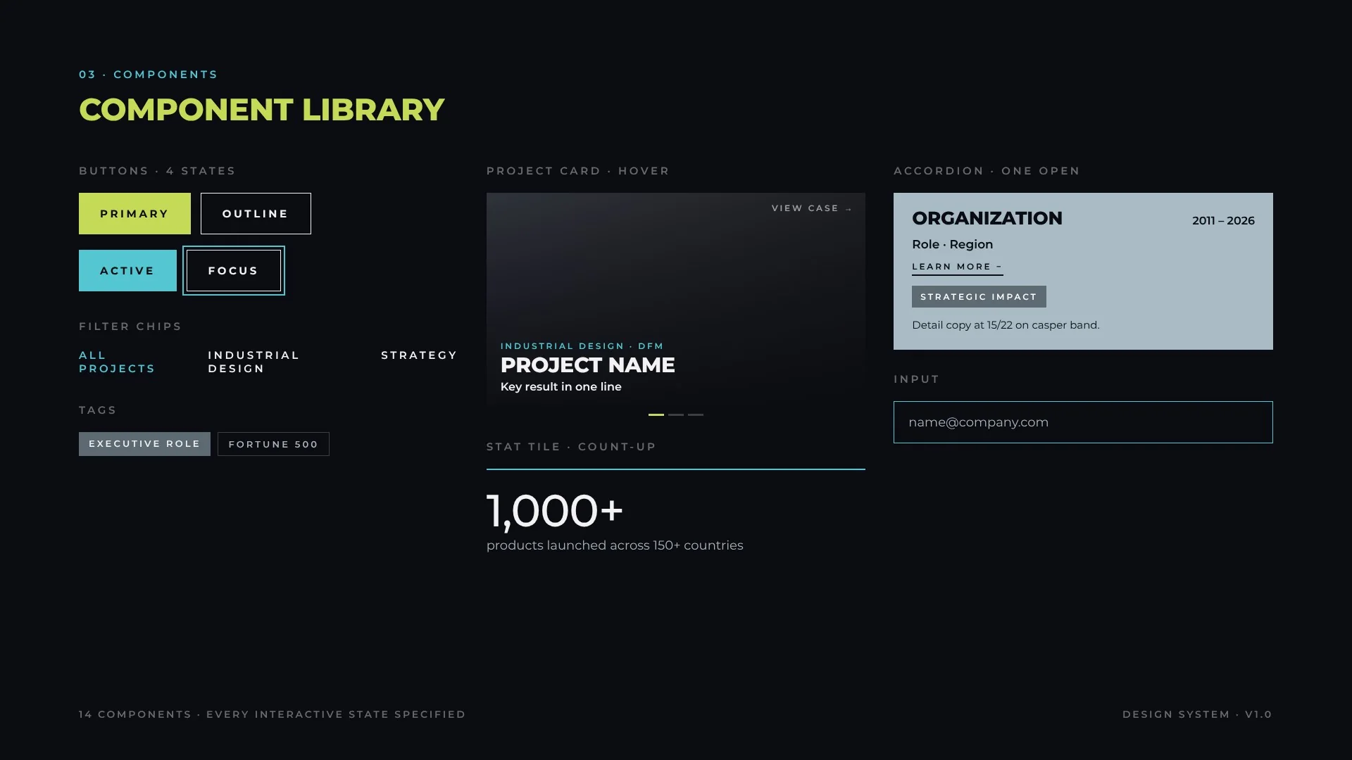
Project card16:9 media · mask · category · title · result · View caseCopy fades in on hover, arrows browse imagesAlt text per slide, link on title
Carousel arrowsChevrons with drop shadowClick hides copy for a clean imageButtons with labels
Dot pager22 × 3 px barsCurrent bar in accentDecorative, mirrored by arrows
Stat tile2 px cyan rule · number · captionCounts up on viewFinal value rendered for readers
AccordionCasper band · header · Learn moreOne open at a time, keeps scroll anchoraria-expanded
Detail tagFill #5E6A72 · white labelStatic5.6:1 contrast
MarqueeLogo or award strip70 s loopPaused for reduced motion
Process stageNumber · key · title · copyGrouped under 3 stage arrowsOrdered list semantics
Input1 px stroke · placeholderCyan on focusLabel associated
CTA bandAccent band · title · 2 buttonsStaticDark text on lime 12.7:1
Component library
08b · Library
Buttons & actions
Buttons are specified as flows, not static shapes: every action shows its next state and offers a way back. The examples below are live; try them.
AsyncLoading and confirmation
{{dl.note}}
DisclosureReveal, submit, confirm
DestructiveConfirm, then undo
MenuChoose, then feedback
{{sh.note}}
ToggleSegmented, single select
PatternSequenceRule
AsyncDefault → Loading (disabled) → Success → resetNever leave a button in loading without a timeout
DisclosureDefault → Expanded → Submit → Confirmationaria-expanded mirrors the panel
DestructiveDefault → Confirm (orange-red) → Done + UndoDestructive color appears only at the confirm step
MenuClosed → Open → Item → FeedbackEsc and outside click close the menu
ToggleOne of N selectedaria-pressed on each option
Buttons & action flows
09 · Interaction
States
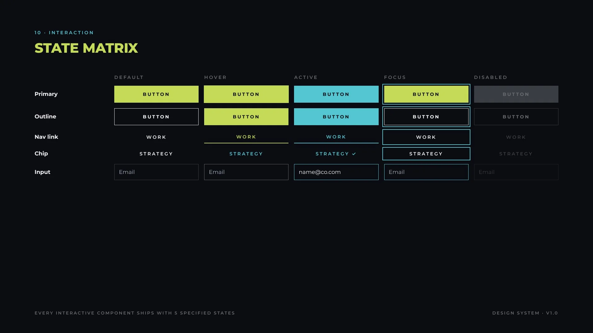
Every interactive component ships with five specified states. Focus is always visible and always the same: a 2 px cyan ring offset 3–4 px.
State matrix
10 · Patterns
Templates & responsive
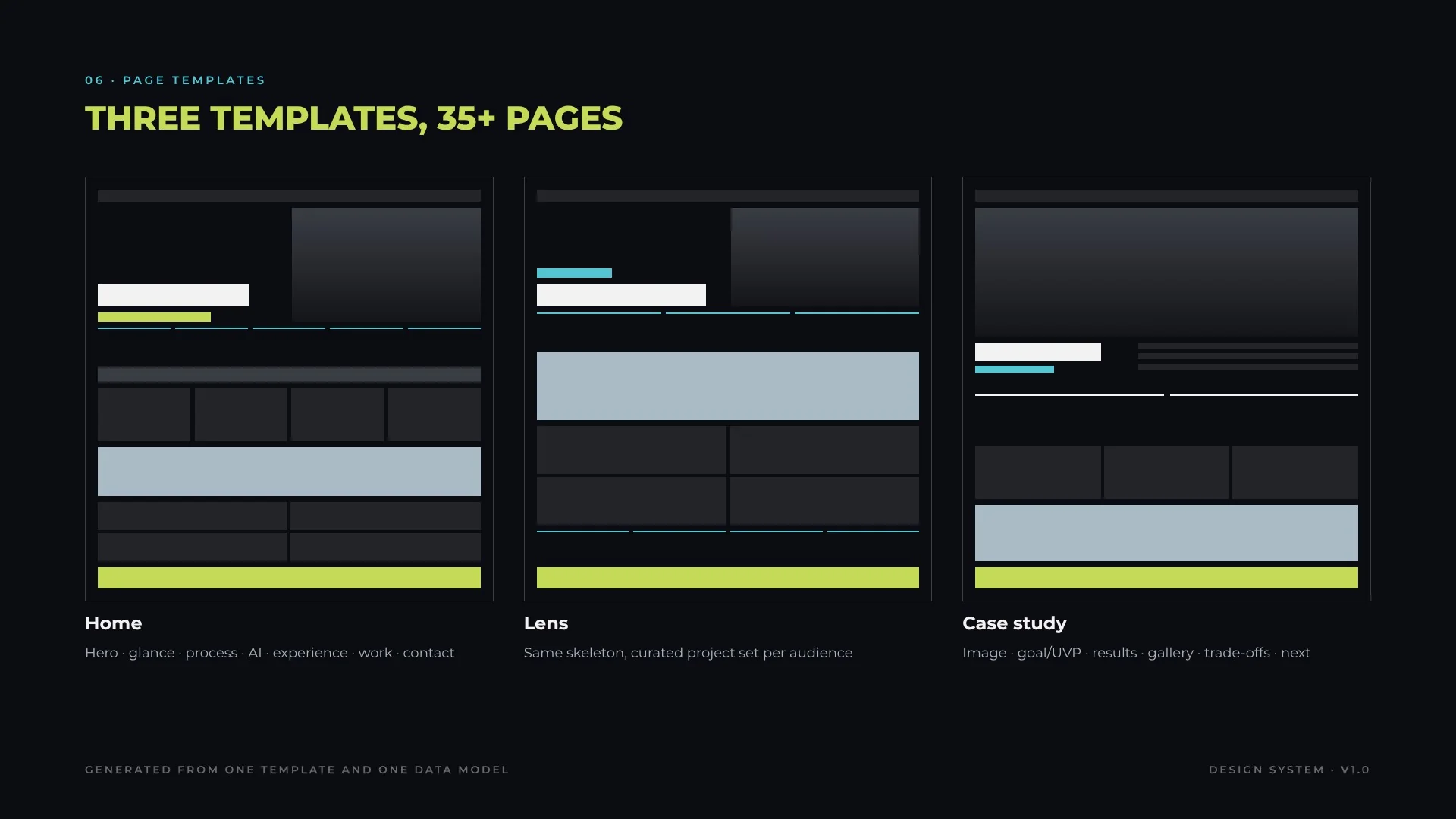
Three templates cover the whole product. Home tells the full story; lens pages reuse the same skeleton with a curated project set per audience; case studies follow a fixed narrative (goal, value proposition, results, innovation, gallery, trade-offs, role) so projects can be compared like for like.
Three templates, 35+ pages
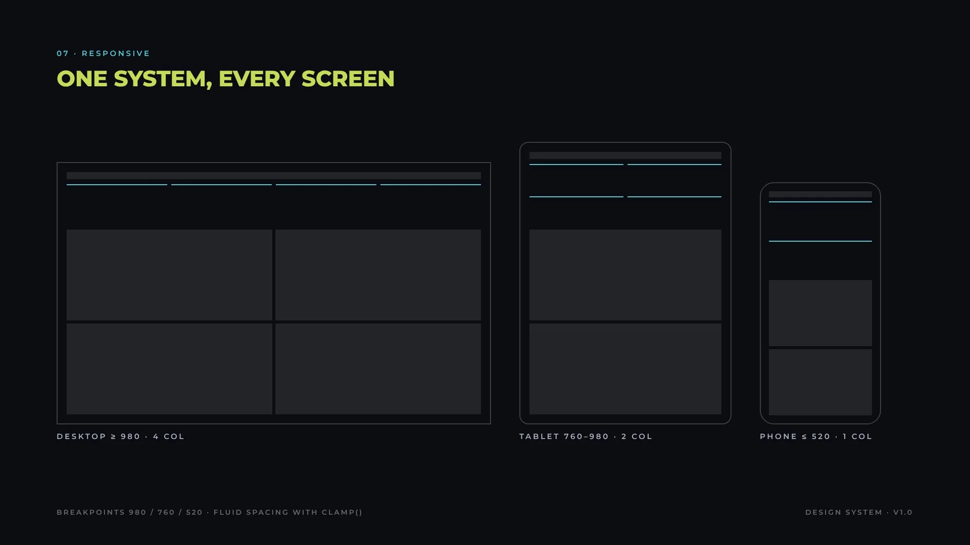
One system, every screen
11 · Content
Content & voice
The voice is executive, direct and evidence-led. Copy states what happened and what it changed, and lets numbers do the persuading.
ElementRule
ResultsNumber first, then the claim: “47% reduction in muscular effort”
AttributionCompany metrics are labelled as environment, not personal results
DatesEn dash, no spaces in ranges: 2011 – 2026 in headers, 2011–2026 inline
LabelsUppercase, 2–4 words, no punctuation
Brand namesKeep official casing: SensAI, GenAI, IoT, AugmentAge, DocSolution
PlaceholdersMarked [to confirm] until verified, never published as fact
12 · Patterns
Data display
Numbers are the hero of the system. They use tabular figures, a 2 px cyan rule and a one-line caption that names the source project.
1,000+
products launched
80+
international design awards
25+
patents
150+
countries reached
Do
One number, one caption, one source
Round honestly and add “+” only for floors
Don’t
Mix units inside one row
Animate numbers that readers must compare precisely
13 · Quality
Accessibility
Accessibility is built into the tokens, not audited at the end.
Contrast matrix
CheckpointStandard
Text contrastAll body pairs AAA; meta grey limited to large text
Focus2 px cyan ring, 3–4 px offset, on every interactive element
SemanticsLandmarks, labelled sections, ordered lists for processes
MediaDescriptive alt text on every image and slide
MotionDecorative only; reduced-motion stops marquee and parallax
TargetsButtons ≥ 44 px tall
14 · Operations
Governance
The system is run as a product, not a file. Changes follow a five-step flow with human approval at every release.
AI-augmented operating model
Contribution model
Anyone can propose; a proposal must name the role it serves and the principle it supports. New values enter only through the semantic tier.
Versioning
Semantic versioning: patch for fixes, minor for new components or tokens, major for renamed or removed tokens. Every release is reversible.
Quality gates
Syntax check of every generated page, contrast check of every new pair, and visual review of the affected templates before publish.
15 · Intelligence
AI & integrations
The system is connected, not stored. Tools talk to the design system through the Model Context Protocol (MCP) and APIs, agents act on it, and SensAI adds the intelligence layer, always with human approval before release.
Connected system
MCP connections
ConnectionWhat it does
Figma (MCP)Reads and writes variables and components so design tokens and code tokens stay in sync
Claude Code (MCP)Agents edit tokens, templates and pages from natural-language change requests
Rhino · Vizcom (MCP / API)3D models and AI renders feed the same asset pipeline and image specs
Browser automationHeadless renders for visual regression before every release
Agents
AgentResponsibility
Token agentProposes and applies token changes across every page
Audit agentScans pages for off-system values, contrast failures and missing alt text
Content agentChecks copy against the content rules (numbers, casing, attribution)
Release agentBuilds, verifies and drafts release notes for human approval
SensAI
SensAI, the AI-native innovation engine, sits above the system as its intelligence layer: it analyzes usage and audience signals, proposes component variants, and validates options with synthetic users before anything reaches the library.
Delivery & operations
ConnectionWhat it does
GitHubVersioned tokens and templates, pull-request review, CI checks on every change
JiraIntake of requests, backlog prioritization and release tracking
SlackRelease announcements and review requests to the team
Notion / ConfluenceLiving documentation generated from the same source
Google DriveShared source files, briefs and asset hand-off
16 · Operations
Tooling
The system is maintained with an AI-augmented toolchain, so one change propagates to every page at once.
LayerTooling
TokensCSS custom properties and component-level style tokens
GenerationTemplate generators build every case page from one data model
AgentsAI agents apply token and template changes across all pages
VerificationAutomated syntax checks and headless-browser renders for visual review
AssetsImage pipeline to 16:9, 1920 × 1080, RGB, with descriptive alt text
VersionChange
1.0Foundations, 14 components, 3 templates, governance model
0.9Accessibility pass: contrast matrix, focus ring, alt text
0.8Token tiers introduced; components moved to semantic tokens